


Good News and Bad
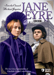
The good: We have cover art for Jane Eyre 1973 (the American release, at least):
And there was much rejoicing in Bronteland because Jane isn't relegated to a tiny cameo in the background somewhere! The colours are a little off, unless, of course, it is my tape which is off... And, look! The caption reads: "The best-loved adaptation of Charlotte Bronte's masterpiece." Larger image can be seen here, from Acorn Media's catalogue page for the production.
Their synopsis:
Considered the best adaptation ever of Charlotte Brontë's classic novel, this BBC miniseries from the mid-1970s stars Sorcha Cusack (daughter of Cyril, sister of Sinéad) as the unwanted orphan girl who finds love and happiness against all odds. Michael Jayston (Tinker, Tailor, Soldier, Spy) is Mr. Rochester, a passionate man with a terrible secret. Seen on PBS and new to DVD. Approx. 248 min. on 2 DVDs.
The bad: The American release date has been pushed back to July 25th. There has been no explanation on this.
![]()

10 comments:
“And there was much rejoicing in Bronteland because Jane isn't relegated to a tiny cameo in the background somewhere!”
Ha, are you talking about the US cover of the 1983 version DVD? With a close-up of Tim Dalton looking dashing and poor Zelah Clarke in the background running around tinily as if she’s missed her bus?
This seems like a nice cover even though Sorcha has a oddly suspicious expression. And is that Miss Ingram on the spine?!!
Sorry to hear about the protracted date. They need more time to include all the extras. ;-)
Wow the 3-D pic looks very heartening- I thought it would be a single DVD case with those two holders for the 2 discs. Actually I would prefer it that way, unless they are just so chock full of extras like a commemorative booklet or something. Anyway, did you see on your Acorn site that JE is "backordered"? Yay! Maybe they might consider getting it out sooner then!
Jane's cloak looks a bit too "bright" blue to me. I wonder if this is a picture of Jane before or after her wedding.
Somehow the bight blue cloak seems inconsistent with her..
To mysticgypsy:
The cloak isn't supposed to be that colour- that is why Bronteana mentioned that the colours are a little off. If you look here you can see that her cloak is supposed to be dark blue lined in a lighter blue. I guess they wanted the cover to hava a purple theme?
to Liz:
Yes, I was poking fun at that 1983 cover. It's just Timothy Dalton's head swollen to fit nearly the entire front cover, and Jane looking very odd as she runs along (I can't figure out: a)Why they chose this picture, b) what scene it's from!)
And Sorcha does have an odd expression here. I wonder if they were trying to find a more 'plain' looking picture. That also looks suspiciously like Blanche...
I shall follow your example and think good thoughts. :)
to thisbeciel:
I am indeed in favour of booklets, posters, plane tickets to England...
to Mysticgypsy:
This picture is definately from before the wedding. This is her plain traveling cloak, and as Thisbeciel said, the colours are definately off. It looks like a dark blue woolen garment. Even when they get married she doesn't dress in bright colours.
"Even when they get married she doesn't dress in bright colours"
Actually there is a possibility that she could have. Which is why Charlotte Bronte leaves us with an uneasy ending.
When Rochester gets back part of his sight, he notices that she has a "pale blue frock on", not a dark, drab color.
hmm...and why has Jane changed so?
to mysticgypsy:
I meant in the mini-series. We only get to see her once after she is married and it isn't clear what the context is but she is wearing a sort of... cream or very light beige with a hint of grey (maybe it's just my tape). It might actually be just after the wedding, since both she and Rochester seem formally dressed although she has no veil or anything like that.
I think the point was that she opjected to wearing certain colours she felt were extravagant. I think he had picked out some reddish satins for her but pale blue is much more subdued and might have simply suited her taste better.
Probably it was a picture they had to recolour and they didn't look back to the original film for visual prompting for colour choices. At a guess. :)
Post a Comment